Category Archives: Decorating Basics

Nothing New Under the Sun

I haven’t blogged during the past couple of weeks because I have been busy traveling back in time and around the world. Okay, not literally, but my day class on Period and Country Decorating Styles took me all the way back to Ancient Egypt. My class was only three hours per day but along with the heavy homework load, I can now more fully appreciate the challenges facing a working mom: from finding childcare to getting dinner on the table, and house cleaning? What’s that?

Today is my first day back in my “real life” and with the children screaming at my feet I am looking at the clock, wishing I had a babysitter coming to my rescue in the next fifteen minutes. Instead we will resume our normal routine: seeking entertainment outside the home in order to maintain everyone’s sanity.

Fast forward in time and my husband is back home to entertain the kids and I’m hoping to entertain (at least interest) you with some of the things I learned during my class. We learned a lot about what details and designs have marked decorating in certain periods of time and how they show up in North American design today (both traditional and modern).

The oldest knowledge we have of interior decor goes back to Ancient Egypt. Would you believe that the design for the ever popular X shaped stool is over three thousand years old? It started like this:

An actual X stool from Ancient Egypt.

An actual X stool from Ancient Egypt.

In modern decor you’d recognize something more like this:

modernxstool

While in traditional decor today you might expect something more like this:

tradxstoolFly yourself East to China and you’ll find the origin of the the “Greek key” pattern which is not so Greek after all.

chinese greek key

Here is one way the Greek key has been applied in modern decor:

moderngreekkey

In more traditional decor it is very popular as a trim on draperies:

Very popular as a trim on drapery.

We can also attribute one of 2014’s decor trends, fretwork, to Ancient China. I love the application of fretwork in both modern and traditional design:

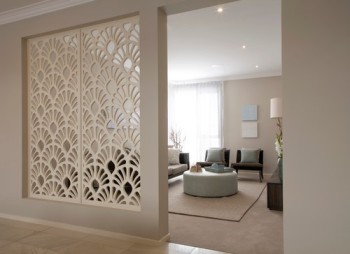
Used as a room divider in a modern living room:

modernfretwork

And as a lovely design feature on the ceiling of this traditional dining room:

tradfretwork

Who knows what other goodies we have missed out on from long ago China? Apparently with each new dynasty, the artwork and design etc of the previous dynasty was destroyed.

Into more familiar territory, there are oodles of decor goodies which have been passed down to us through the history of Europe which will likely be recognizable to you. Did you know that the parquet which we so shudder at today originated during Tudor times in the 16th century? Their version of parquet was a far cry from what we see today:

A tudor parquet pattern.

A Tudor parquet floor pattern. Breathtaking.

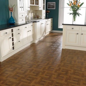
Somewhere in the 20 century things got off track and they began manufacturing the terrible, honey blonde slabs of parquet which most of us associate the word with. Thankfully, after many year of this duddy flooring the design gods have gotten back on track and started coming out with lovely patterns like this:

I don't know about you but I would consider putting something like that in my house. gorgeous.

The pattern almost looks like a Greek key and I love it.

While today we enjoy the luxury of radiant heating and gas fireplaces, during the reign of Queen Anne in the 18th century, people had to come up with innovative ways to keeps themselves warm. One such idea was the wing back chair. The premise was that the wings of the chair would block the draft and keep their heads warmer. Today we continue to enjoy the classic lines of this chair.

Here is a very modern, dare I say almost space age, version of the wing back chair:

modwingbackchair

The wing backs in this traditional living room give you a better idea of the original design:

tradwingback

There isn’t much of a positive spin that can be put on Napoleon’s reign in the early 19th century but if I could shoot at one, it would be that the sleigh bed took off at this time, though its earliest roots are in Rome.

This super modern sleigh bed is pushing the edge of what a sleigh bed is but I love the look: it reminds me less of a  sleigh and more of the toboggan I rode on as a child.

modernsleighbed

You are likely more familiar with the kind of sleigh bed seen in some more traditional bedrooms these days:

tradsleighbed

Around the same time Napoleon was wreaking havoc in France, Germany was perfecting the art of wood veneering. Though this was not the beginning of veneering, the Germans excelled at the craft and created extraordinary pieces of furniture in what is known as”Beidermeir” style.

beidermeirvenner2

A stunning Beidermeir secretaire

Veneers are used in much the same was as seen above in today’s traditional decor but are also used to help create sleek modern designs such as in the kitchen below:

Veneering is an eco-friendly (all-be-it) expensive way of using exotic woods.

Veneering is an eco-friendly albeit expensive way of using exotic woods.

The funny thing is that they used these veneers due to the economic necessity of not using too much wood. Now-a-days, to get a piece of furniture with that quality of veneer it may well be more expensive than a piece of solid wood furniture.

Once we reach the Victorian era, starting in 1837, there is not much new under the sun. This period of history marks the beginning of the first truly eclectic decor style where the good, the bad, and the ugly of all the previous generations were incorporated to create Victorian style. They did however add some distinct pizazz at this time with excessive trim and the first tufted furniture. I’m not a big fan of trim but give me tufting any day.

Here this modern sofa is enhanced with a few selective tufts:

modtuftedsofa

This sofa would fit as well in Victorian times as it would in a traditional living room today:

victoriantufted

From there we hit the 20th century and design history repeats itself. There is nothing new under the sun, simply new applications of old design. But aren’t we lucky that we had such design-savvy ancestors to pave the way?

Special thanks to Bea O’Driscoll for the passing on of this knowledge and to my husband for helping me carve out the time to relax and write this post.


Leave a comment

Filed under Decorating Basics, Uncategorized

Careful Metal Mixing in Interior Decor

Mixing metals has long been considered a design faux pas but it also happens to be one of 2014’s decor trends. I suppose rules are meant to be broken and it is hard not to break this one when there are so many delicious golden accessories to add to your (likely) predominately silver metaled home.

As with breaking any rule, it is important to take precautions to not get caught, in this case, with a gaudy, awful mess of a home. If you are itching to try the trend, or just take that gorgeous golden heirloom out of your cupboard, consider these four suggestions on how to carefully mix your metals.

1.) If you are nervous about mixing metals, err on the side of caution and choose just two finishes that you like. Chrome and/or brushed nickel go nicely with a soft brushed gold. Bronze works well with brass or iron.

A pleasent mix of bronze and iron.

A pleasant mix of bronze and iron (bronze round table and iron sculpture on the fireplace)

This is a gorgeous blend of brushed nickle and soft gold. It doesn't jar the eye.

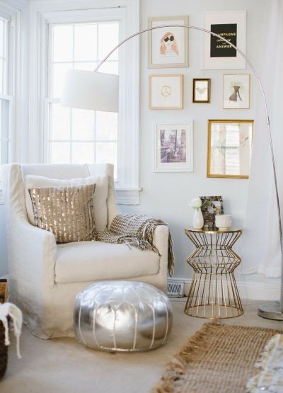
This is a gorgeous blend of brushed nickle and soft gold. It doesn’t jar the eye.

2.) Think of the metal finish you want to add to your room as though it were an accent color. The rule of thumb with accent colors is that you should have at least three hits of it in a room to draw the eye throughout the space and provide a sense of cohesion. The same can be said of adding some brass or gold to a room predominated by chrome. The picture below exemplifies this beautifully.

bronzeandsilver

3.) Having an accessory or piece of furniture that is made of mixed metals makes visual sense out of having different metals displayed throughout a room.

The antiqued glass of this console gives the appearance of a silver metal which contrasts the golden trim.

The antiqued glass of this console gives the appearance of a silver metal which contrasts the golden trim.

The mirror relates well both to the silver console and the bronze lamp.

The mirror relates well both to the silver console and the bronze lamp.

4.) Using frames of varying metals for a gallery wall is a good way to tastefully introduce different metals into your room. It has the same kind of affect as a piece of furniture made of mixed metals because with a gallery wall the cluster of art tends to visually read as one piece, paving the way for mixed metals throughout the rest of your room.

mixedmetalwall

With all the gorgeous golden accessories out there it’s hard not to want to jump on board with this trend. I will be breaking up all the chrome in my powder room with these stunning 3D sculptures from Lofty Living:

As soon as I get thee lovelies onto the wall I'll be doing my far overdue bathroom reveal.

As soon as I get thee lovelies onto the wall I’ll be doing my far overdue bathroom reveal.

Here are some beautiful pieces to temp you to trend:

Cheater metal mix with anthropologie's gold sequined pillows.

Cheater metal mix with anthropologie’s gold sequined pillows.

Brass and glass boxes from Crate and Barrel.

Brass and glass boxes from Crate and Barrel.

Classy glass and bronze side table from West Elm.

Classy glass and bronze side table from West Elm.

Rose gold paper organizer from CB2.

Rose gold paper organizer from CB2.


4 Comments

Filed under At home, Decorating Basics, Eye Candy, Uncategorized

Customizing Store Bought Curtains

Something I learned early on in my interior decorating education is that if you want to make money in this field, window coverings is a good specialty to get into- because they are expensive. Really expensive. I don’t plan on specializing in window coverings and I certainly don’t plan on spending hundreds of dollars on my own so I’ve been looking into inexpensive ways to get a custom look.

One of the rules of window coverings is to hang your drapes or curtains high and wide (see below for an example of what I mean).

windowright

This presents a problem to the average Jane who can’t afford custom made curtains. Most big box stores sell curtains that are either too short or not full enough to look good on wide windows. Thankfully the creative geniuses of the world have gifted us with many ideas for taking simple and inexpensive Ikea (or similarly priced) curtains and giving them custom credential.

Whether your need is extra length or width, or you simply want to make your curtains special, here are a few ideas for pimping out your store bought curtains:

This is a great way to add some pattern or colour to plain Jane curtains. Check out justagirlblog for great no-sew directions for making curtains like this.

bottomadded

A different take on the same idea, the next example definitely requires some sewing but looks fantastic.

Contrast fabric added to top of store bought curtain panel.

Contrast fabric added to top of store bought curtain panel.

If some extra volume is your need it is simple enough to sew store bought curtain panels together. Click here for a great tutorial by Bryn Alexandra on how to do this and ignore the section about how to pleat if that isn’t your fancy.

Each side of the window has two curtain panels sewed together.

Each side of the window has two curtain panels sewed together.

Adding trim is another simple and fun way to customize curtains:

These are custom made curtains but sewing some fridge along the edge of your store bought curtains is a piece of cake.

These are custom made curtains but sewing some fridge along the edge of your store bought curtains is a piece of cake.

If the thought of sewing makes you break into a sweat, how about paint? Here are some beautiful examples of curtains which have been customized with fabric paint:

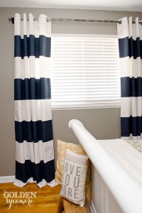
paintedstripes

All you need to get this look is some tape to mark of your lines and some fabric paint.

This one would require a stencil.

This look is a bit trickier to achieve and requires a stencil.

I didn’t need more volume or length for the curtains I recently bought and I was pleased with the pattern but I did want to fancify them. Thanks to some simple instruction from Addicted2Decorating I was able to add some class to my $15 Ikea curtains:

Before

I'm not at all a fan of the shirred curtain top but love the bold indigo stripe.

I’m not at all a fan of the shirred curtain top but love the bold indigo stripe.

After, in my living room.

These type of pleats are called "euro pleats" or "parisian pleats" and are appropriate for both tradition and modern design.

These type of pleats are called “euro pleats” or “parisian pleats” and are appropriate for both traditional and modern design.

Another pleat you can easily make on store bought curtains is the pinched pleat which gives more of a traditional look. You can use the same directions as given in the tutorial I mentioned above.

A more traditional pinch pleat.

A more traditional pinch pleat.

When you pleat the curtains they actually become drapes (the distinction is too convoluted for me to feel like getting into). If you do decide to pleat your store bought curtains take the cost of the drapery hardware into consideration. The drapery hooks were “donated” to me by my mother in law but the rings needed for hanging actually cost more than the curtains themselves ($7 per pack of 7 at Wallmart, I needed three packs). They aren’t that expensive but if money is tight it is important to add in.

Above are just a very few of the many options you have for customizing your store bought curtains. If the idea strikes up a desire for some DIY simply click on one of the links I noted above or have fun searching out your own DIY tutorials. If you find any good ones feel free to leave a link in the comments section!

1 Comment

Filed under At home, Decorating Basics, DIY Projects

Draped in Bling

The director of my program says that 90% of people in Vancouver decorate in traditional style, whether they know it or not. This means that when it comes to window coverings, I need to be open to decorating with some frills. When I think traditional drapery accessories something like this comes to mind:

picresized_1300031679_DSC_0023-e1300035395333

Massive tassels. Fringe. Okay. It might be good traditional design but it makes me a bit nauseated. I’m just not a big fan of all the frills.

However, research for my homework has led me to re-evaluate my attitude towards drapery accessories. In fact, I have started to embrace the idea. I mean, we all know that there are some gorgeous finials out there (the ball things at the end of the curtain rod) but what I didn’t know is that there is a gorgeous variety of curtain tiebacks. These drapery accessories aren’t just for traditional style.

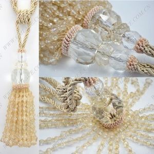
I’m loving these beaded tie backs:

SONY DSC

SONY DSC

bedbathbeyond

This one would be super easy and inexpensive to DIY.

$T2eC16FHJHoFGlkkO+vsBR97FPZ(2!~~60_58

How about a beaded tassel?

carousel_lr

9145

Beige-Tie-Cord-font-b-Beads-b-font-Curtain-font-b-Tiebacks-b-font-Tie-BacksTASSEL-1.157131918_std

Something a bit more simple but still stunning:

bling

I love the vintage appeal of this one.

I love the vintage appeal of this one.

In fact, there are even some tassels that I could pick out for a a really traditional client and not shudder at:

f34e09a6c3c320ff46fbb1e939b12c26

houlesBeaugencyEmbrassebis_thumb8

Another thing that I have learned about window coverings is that they are super expensive. Even to DIY myself a pair of drapes for my bedroom would take 15 yards of fabric to get the proper fullness. At say, $25 a yard, it really adds up. However, when I’ve saved up enough pennies, I look forward to adorning my windows with drapes and all kinds of bead emelished bling.

Though it is true that the beaded tiebacks would be easy to DIY, that many beads would cost a pretty penny. Better off buying from those who have the resources to buy beads at wholesale costs. You can find beautiful beaded accessories, as well as more traditional tassels at Design with Confidence in New Westminster. Many of these accessories are a steal at under $20.

Don’t feel like driving to New West much less leaving your home? These etsy shops also sell some winning tiebacks:

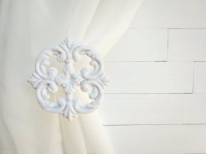
Willows Grace for vintage metal tiebacks (white metal flower tieback pictured above is from this store)

Earthlie Treasures for beaded tiebacks

Lynn’s Graceland for metal tieback/hooks with crystal detailing

There aren’t many tassels for sale on etsy, beaded or otherwise, so you are best off checking out online retailers like Ali Express.

Leave a comment

Filed under Decorating Basics, Eye Candy, In the Royal City

Straight up (and down): Can Vertical Blinds be Stylish?

I’m currently taking a night class on window coverings. To be honest, I signed up to take the class this semester because it is a requirement for my diploma and I wanted to get it over with. For me it was one of those, “do I have to?” classes. However, I’m amazed at how much there is to learn and how, and as in every interior decorating class I take, my preconceptions are challenged.

My first class the dreaded “vertical blinds” were mentioned. I only expected to hear above these in association with the words, “don’t do it!”. I certainly have never seen them in a decorating magazine; though come to think of it, you don’t see a lot of pleated shades and I think they’re pretty great.

I admit that putting window coverings on sliding doors is a challenge but vertical blinds? Can they really look good? My instructor, a very sage decorator, insists they can.

As part of my homework this week I had to find pictures of different “hard” window coverings, and I was determined to give vertical blinds a fair chance during my search.

Are you skeptical like me? Maybe the following pictures will change your mind.

(For the sake of comparison, this first picture is an example of an ugly metal vertical blind.)

ulgyverticals

And onto the surprisingly pretty…

11b34e688a3a7cc36bc3a4ac75c9859d

Stylish-Blinds-with-Vertical-Decoration-Suited-with-Interior-Themes

Vertical-Blinds-8

Candlelight-White-vertical-blinds-with-Stylish-looks-for-Big-Window-Levolor-Collection

vertical

vertical blinds modern

Are you convinced? I’ve got to admit, deep down I still cringe at the idea of having them in my own home. However, what my search has shown me is that vertical blinds can be used in a stylish way in a variety of settings, and sometimes they are simply the most practical option. When one must, it doesn’t have to be a bust! (oh dear, I spend way too much time reading children’s books.)

Leave a comment

September 26, 2013 · 9:41 pm

Walk the Line

There are five elements of design, that is tools used by designers to implement good design. In this post I will be talking about one of my favourite tools, line. It is not something I had thought about previous to taking my course on Basics of Design but ever since the importance of it has captured my eye.

The six different types of line used in design are vertical, horizontal, diagonal, jagged, spiral, and curved. All these different types of lines guide the movement of our eyes in a space and help to create the type of atmosphere the designer is trying to achieve. For example, vertical lines are more formal and masculine whereas curved lines are more restful and feminine.

Here are some pictures of different rooms. I have noted some of the different lines represented in the pictures but if you are interested in the concept take a look and see what other ones you can find.

The chairs, side table and coffee table have examples of curved line.

The chairs, side table and coffee table have examples of curved line.

Spiral lines are most common in traditional design as shown here on the stair railing. The furniture in the living room also has good examples of curved lines.

Spiral lines are most common in traditional design as shown here on the stair railing. The furniture in the living room also has good examples of curved lines. Diagonal line is represented by the tufting on the ottoman.

Zig zags are a good example of jagged line. You also see jagged lines in the design of some more modern furniture pieces.

Zig zags are a good example of jagged line. You also see jagged lines in the design of some more modern furniture pieces.

The columns and window pains are examples of vertical line. Vertical lines increase the visual height of a room.

The columns and window pains are examples of vertical line. Vertical lines increase the visual height of a room. The base of the floor lamps are another example of spiral line.

How awesome are those shelves! And a great example of diagonal line. The drum stools and lamp shades are examples of circular line and the sofa an example of horizontal line.

How awesome are those shelves! And a great example of diagonal line. The drum stools and lamp shades are examples of circular line and the sofa an example of horizontal line.

The shelves are examples of horizontal line.

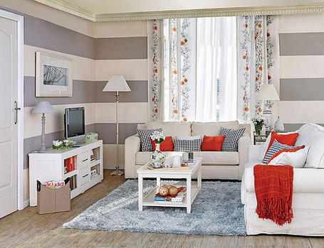
The shelves and stripes on the wall to the right are examples of horizontal line.

The use of different types of lines helps to balance the appearance of a room. For example, even if you are wanting to create a very masculine space it is good to have some gentle curves to rest your eyes on or the room may feel too rigid.

If there are too many vertical lines in a room that sense of rigidity is palpable for me and I feel ill at ease. Especially in new construction where homes are often quite boxy I need the softness of curves to balance out the strength and rigidity of the hard lines. Part of the reason why I like vintage objects is that they tend to have more interesting lines and add softness to a contemporary setting. For example I have a curvy old fashioned rocker and a vintage mirror in my sons room which helps to balance out the otherwise straight lines.

The curve of the flag pennant and the base of the lamp also adds softness.

Line can also increase the visual size of a space. Vertical lines lead the eyes upwards and visually increase height whereas horizontal and diagonal lines visually increase the width of a space. If you live in the Greater Vancouver Area you know the importance of making a small space seem as big as possible. Painting strips on your walls is an easy and inexpensive way to create the look of more space. You may have mostly seen this done in children’s rooms but it can be done beautifully in adult spaces as well:

lilac-living-room gray-living-room-with-horizontal-striped-wall

I could go on and on about line but I don’t want to prattle much more. I hope that this has been interesting and informative and given you something to consider as you look around your own space. I’m a bit of a geek when it comes to loving lines but next time you are flipping through a design magazine consider the impact the lines of the room have on the atmosphere and visual size of the space. It’s a truly fascinating aspect of design (or as I said, I might just be a design geek).

Leave a comment

Filed under Decorating Basics

Playing with Pattern

While I fully believe that rules are meant to be broken (I mean did they really expect me not to go into that pyramid in Chichen-Itza?), when you are learning a new technique, such as mixing patterns, it helps to follow some basic rules. While many well known designers have earned the right to break design rules, I am a novice and find them helpful.

There are four classic combinations of pattern matching which I will draw attention to and exemplify through pictures. Please note that the pattern matches I show are based on the colour as I see it on the computer screen. It is very important to see samples of the fabric in person before purchasing as the colours as shown on-line can be deceiving and colour matching is very important for a cohesive design look. Many fabric companies sell differently patterned fabrics with coordinating colours which makes pattern matching much easier.

Another  important element of pattern matching is mixing the scale of the patterns. A room with all large scale patterns would be chaotic looking. It is good to have a mix of large, medium and small scale patterns. It is okay to have more than one of each scale but if you are worried about making errors keeping it to one of each will help keep you on track (in the pictures below I have noted what scale the pattern is because each picture of the fabric is taken from different distances so unless you look at the scale at the bottom of the picture it is difficult to tell the size. Some look quite large in scale but are actually just a picture taken from very close up and vice versa.) 

Without further ado…

Geometric plus floral:

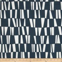
Geometric

Geometric

Due to the flowing lines of this ikat it could be considered a floral

Due to the flowing lines of this ikat it could be considered within the category of “floral”.

dwell studio mazascene taupe geometric

medium geometric

Dwell studio vintage blossom azure

large floral

Two similar patterns of different scale (eg. a medium scale and a large scale floral or a large scale plaid and a small scale plaid). The four fabrics below could also be used all together for a complex pattern mix.

Richloom whipporwill blue have, fabric.com

medium floral

large floral

large floral

large plaid

large geometric

small geometric

small geometric

     Same pattern/ different colours:

cheveronpurpleyellow zig zags

Complex Pattern mix:

Three different scale florals plus one geometric:

premier prints graffiti drew berries

small floral

preimier prints rosa drew berries

medium floral print

preimier prints hippie chic

large floral print

very small geometric

very small geometric

Two different scale florals and two different scale geometrics.

thomas paul dahlia aegean

Large floral

robert allen multiop slub pool

large geometric

robert allen mod lay out slub

medium geometric

robert allen luxury floral pool

medium floral

While all the pattern samples shown above are fabric samples, pattern can also come from other aspects of the room like wallpaper and rugs. A general suggestion for larger surfaces like these is to use larger scale patterns so that it doesn’t look too busy.

I personally have commitment issues when it comes to colour and pattern in my main living spaces and if you are like me an easy and less expensive way to start your exploration in pattern matching is throw pillows.

I hope that this little tutorial is helpful for you. Please feel free to e-mail me at heather@fabrictherapy.ca if you have any questions. I purposefully only showed pictures of the patterns because I thought it might make things clearer. If you google search pattern mixing you will get a wealth of pictures with beautiful pattern mixes. Happy pattern mixing!

4 Comments

Filed under Decorating Basics

Discovering colour palettes through art: Large Nude

In my colour class, in order to prepare us for future clients who may want their space decorated around a specific piece of art, we were asked to choose an inspirational picture. The goal was to then pull out colours from the artwork to make a colour scheme for the theoretical room.

This is the painting I chose:

"Large Nude" by Renoir

“Large Nude” by Renoir

This work was painted in 1907, and in my eyes represents a time when beauty was not determined by today’s impossible standards. It is inspiring to me to see a curvaceous woman lazing around nude, with a peacefully unabashed countenance. As someone who has struggled with an eating disorder in the past, it is a breath of fresh air to see an “imperfect” body portrayed as being so lovely that it inspired a masterpiece.

The colour palette I came up with below is an analogous colour scheme (See Colour Schemes 101: I can sing a rainbow). These colours represent all the different decorating aspects of the room, not just paint colour. One or two might be a paint colour in the room whereas the other colours could represent furniture, throw cushions, rugs, curtains, wood tones etc. They aren’t particularly colours that I would be inclined to design with in my own home, but the point was to pick colours that represent the artwork.

yellow-green (stretching a bit here, there isn't too much yellow in it)

yellow-green (stretching a bit here, there isn’t too much yellow in it)

yellow (cream is derived from yellow)

yellow (cream is derived from yellow)

yellow-orange

yellow-orange

orange (brown comes from adding black to orange)

orange (brown comes from adding black to orange)

red-orange

red-orange

I am still a novice at this practice but it is fun to play around with colour. The magazine House Beautiful has a section every month where they do something similar to this. If you are interested in the concept but don’t feel like buying a magazine check out the website design seeds: it beautifully demonstrates this practice and is fun to browse around.

Leave a comment

Filed under Decorating Basics

Colour Schemes 101: I can sing a rainbow

I have been teaching my daughter colour theory since she was under a year old, using colourful toys as props. Example, “Sofia, these blocks are red, yellow, and blue. Those are primary colors. When you add them together you get secondary colours like orange”. When I confused her enough with that I moved on to “Sofia, look at these balls, they are orange and blue. That’s a complementary colour combination”. When I recently started struggling with saying, “well..that’s not really red Sofia, its more of a red-orange…” my husband thought it was time to simplify things. Right. Keep it to “I can sing a rainbow”. For now.

However, if you are old enough to be reading this then you are old enough to let me indulge in talking about color schemes without causing too much confusion or stunting your learning curve.

As they say, a picture is worth a thousand words, so here are some beautifully decorated spaces exemplifying some common colour schemes.

Monochromatic Color Schemes: using any tint (white added to colour), tone (grey added to colour), or shade (black added to colour) of one colour.

Ah, Sarah Richardson, I love her bold style of decorating

Ah, Sarah Richardson, I love her bold style of decorating

Talk about sunny side up

Talk about sunny side up

Analogous Colour Schemes: using two to five colours consecutive on the colour wheel

analagous yellow-green, green, blue-green

analagous yellow-green, green, blue-green

Another beauty by Sarah Richardson. Analogous orange, yellow-orange, yellow, yellow green color scheme

Another beauty by Sarah Richardson. Analogous red-orange, orange, yellow-orange, yellow, yellow-green color scheme

Complementary: using two colours opposite one another on the colour wheel

I love orange and blue contrasting colour schemes. Or in this case, red-orange and blue-green

I love orange and blue contrasting colour schemes. Or in this case, red-orange and blue-green

Gorgeous lofty red-green contrasting scheme

Gorgeous red and green contrasting scheme. It doesn’t have to look like Christmas.

Split Complementary: Using two colors on either side of the colour’s complementary colour

Loosley a split-complementary red orange, red-violet, and green (though the couch is really more of a yellow-green)

Loosely a split-complementary red-orange, red-violet, and green (though the couch is really more of a yellow-green to be honest. Designers take liberties with these things)

Yellow, red violet, and blue violet (they snuck in a bit of blue-green two but ignore that :-)

Split complementary yellow, red violet, and blue violet (they snuck in a bit of blue-green on the ottoman but ignore that 🙂

Triad: Using three colours equally spaced from each other on the colour wheel

Triadic colour scheme done in red, yellow, and blue

Triadic colour scheme done in red, yellow, and blue

violet, orange, green triadic colour scheme

Violet, green, and orange triadic scheme. Orange is “the mother of all beige” and therefore the beige counts as the third colour in this triad.

Tetrad: Using a combination of four colours that are two sets of complementary colours.

Green, red, blue, and orange tetrad colour scheme. These schemes are mostly seen in children's rooms as they are quite loud.

Green, red, blue, and orange tetrad colour scheme. These schemes are mostly seen in children’s rooms as they are quite loud.

Two common color combinations that do not fit into traditional color schemes include blue and yellow (often seen in French country decorating) and red, blue, and white (often seen in…America)

A little bit of french country yellow and blue

A little bit of french country yellow and blue

Red White and Blue Colour Scheme

Tried and True, American red, white and blue. Its a fairly common coastal cottage type scheme.

Some non-colour “colour” schemes are achromatic, the use of black and white in decorating, and neutral, decorating with beige, grey, and/or cream.

Achromatic Living Room

Achromatic Living Room

Dining room decorated with neutral beige

Dining room decorated with neutral beige

One last colour scheme to consider is polychromatic…that is, the use of all the colours on the colour wheel.

I appreciate the artistry but I would go insane staying in this hotel room

I appreciate the artistry but I would go insane staying in this hotel room

Kids rooms or playrooms are about the only place you should see a polychromatic scheme in my opinion

Kids rooms or playrooms are about the only place you should see a polychromatic scheme in my opinion

Hopefully some of these examples will help you in your next decorating venture.  For more colour combinations pick up a colour wheel from your local craft store and have a gander. If you stick to the tried and true schemes it should help to make your decor a success!

If you don’t feel like buying a colour wheel this link is helpful for looking at different colour combinations on the colour wheel.

2 Comments

Filed under Decorating Basics